Checkout Page Optimization: 9 Changes that Increase Conversions
Reading Time
7
Published On
Updated On

Brian Moran
Founder

Samara Lemon
VP of Marketing

Leilani Treuting
Marketing Director

Scott Moran
Co-Founder

SamCart is the digital business platform that builds, runs, and scales your online business. AI handles the hard parts, so you keep more of what you earn.

Table of Contents
Title
Share this article
A high-converting checkout page is short, fast, and asks for as little as possible. The nine changes below - fewer form fields, one-page layout, mobile-first design, trust signals near the button, order bumps, upsells, autofill, clear pricing, and a fast load time - are the ones that move the needle most for digital product sellers.
Quotable summary: Most checkout pages lose money before the customer ever sees a "thank you" page. SamCart's own checkout, built around these nine changes, completes in about 8 seconds and converts 3-4x higher than the industry average. One seller went from a 3.15% conversion rate to 8.91% after switching from a multi-step form to a single page with an order bump attached.
Here's a stat that should bother you: most checkout pages ask for information nobody needs at the moment of sale. Name, email, billing address, shipping address, phone number, company name, all before the customer has typed in a card number. Every extra field is a chance for someone to close the tab.
You already did the hard part. You got someone to click "buy." The checkout page is where you either keep that sale or lose it to a slow form, a confusing layout, or a page that makes someone re-enter their card three times because a validation error wasn't clear.
This post walks through nine specific changes you can make to your checkout page, in order of impact, with the reasoning behind each one.
What is checkout optimization?
Checkout optimization is the process of removing friction from the steps between "add to cart" and "payment complete" so more people who start checkout actually finish it. It's not about redesigning your whole funnel. It's about the one page where money changes hands.
The average ecommerce cart abandonment rate sits around 70%, according to the Baymard Institute. For digital products specifically, a slow or confusing checkout can push that even higher, because there's no physical product to build anticipation while someone waits.
Why checkout optimization matters more than traffic
Most sellers respond to a slow month by spending more on ads. That's backwards. If your checkout page converts at 2% and you fix it to convert at 6%, you just tripled your revenue on the traffic you already have. No new ad spend required.
This is the math Brian talks about constantly: fixing your checkout is often the highest-ROI thing you can do in a single afternoon, because you're not paying for more visitors, you're keeping more of the ones who already showed up.
The 9 changes that increase checkout conversions
1. Cut your form fields to the minimum
Every field beyond name, email, and payment info is a reason to abandon. If you don't need a phone number to deliver a digital product, don't ask for one. SamCart checkouts default to only what's required to process the sale and deliver the product.
2. Move to a single page, not a multi-step flow
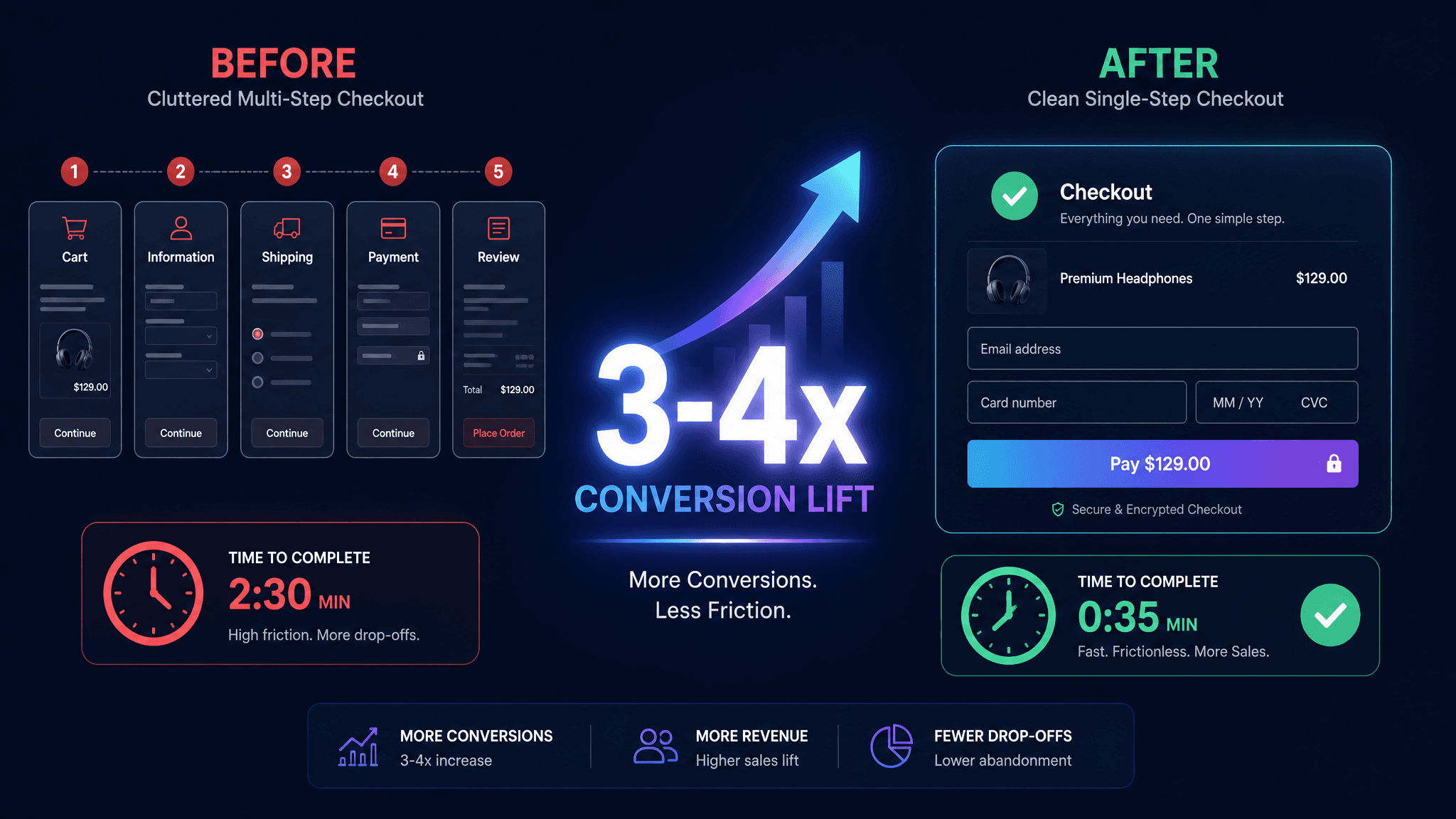
Multi-step checkouts (cart page, then shipping page, then payment page) add load time and decision points where people leave. A single-page checkout with everything visible up front, price, product, and payment field, removes those exit ramps. This is the single biggest lever in this list.
3. Design mobile-first, not mobile-adjusted
More than half of checkout traffic for most digital product sellers comes from a phone. If your checkout was designed on a desktop screen and just "shrinks" on mobile, buttons get small, forms get cramped, and people give up. Build for the phone screen first, then scale up.
4. Put trust signals right next to the buy button
Security badges, a money-back guarantee line, or a simple "secure checkout" label near the payment field reduce the moment of hesitation right before someone commits their card number. This isn't decoration. It answers the unspoken question "is this safe" at the exact moment it comes up.
5. Add one order bump, not five
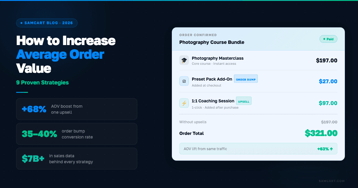
An order bump is the small, one-click add-on offer that shows up on the checkout page itself, before the sale is complete. Done right, a single relevant order bump adds real revenue with zero extra ad spend. Adding too many bumps clutters the page and slows the decision down. One is the right number for most offers.
6. Show a real-time order summary
People want to see exactly what they're paying for and how much, updated live if they add a bump. A checkout that hides the total until the very end, or makes someone scroll to find it, creates doubt. Keep the price and the product name visible the whole time.
7. Use autofill and saved payment methods
Every keystroke you can remove is friction you removed. Apple Pay, Google Pay, and standard browser autofill cut a 90-second checkout down to seconds. If your checkout page fights against autofill (custom field formatting that breaks it, for example), you're adding friction on purpose without meaning to.
8. Cut load time to under 2 seconds
A slow-loading checkout page bleeds sales before anyone even sees the form. Every second of delay is a second where someone can change their mind, get distracted, or close the tab. Compress images, cut unnecessary scripts, and test your checkout speed the same way you'd test any other part of your funnel.
9. Offer a post-purchase upsell, not a pre-purchase one
Once someone has completed the first sale, a one-click upsell (a related product or upgrade shown immediately after purchase) converts far better than trying to upsell before the sale happens. The psychology is simple: they already said yes once. Asking again, for something related, right after, catches them at their highest point of trust.
What this looks like in practice
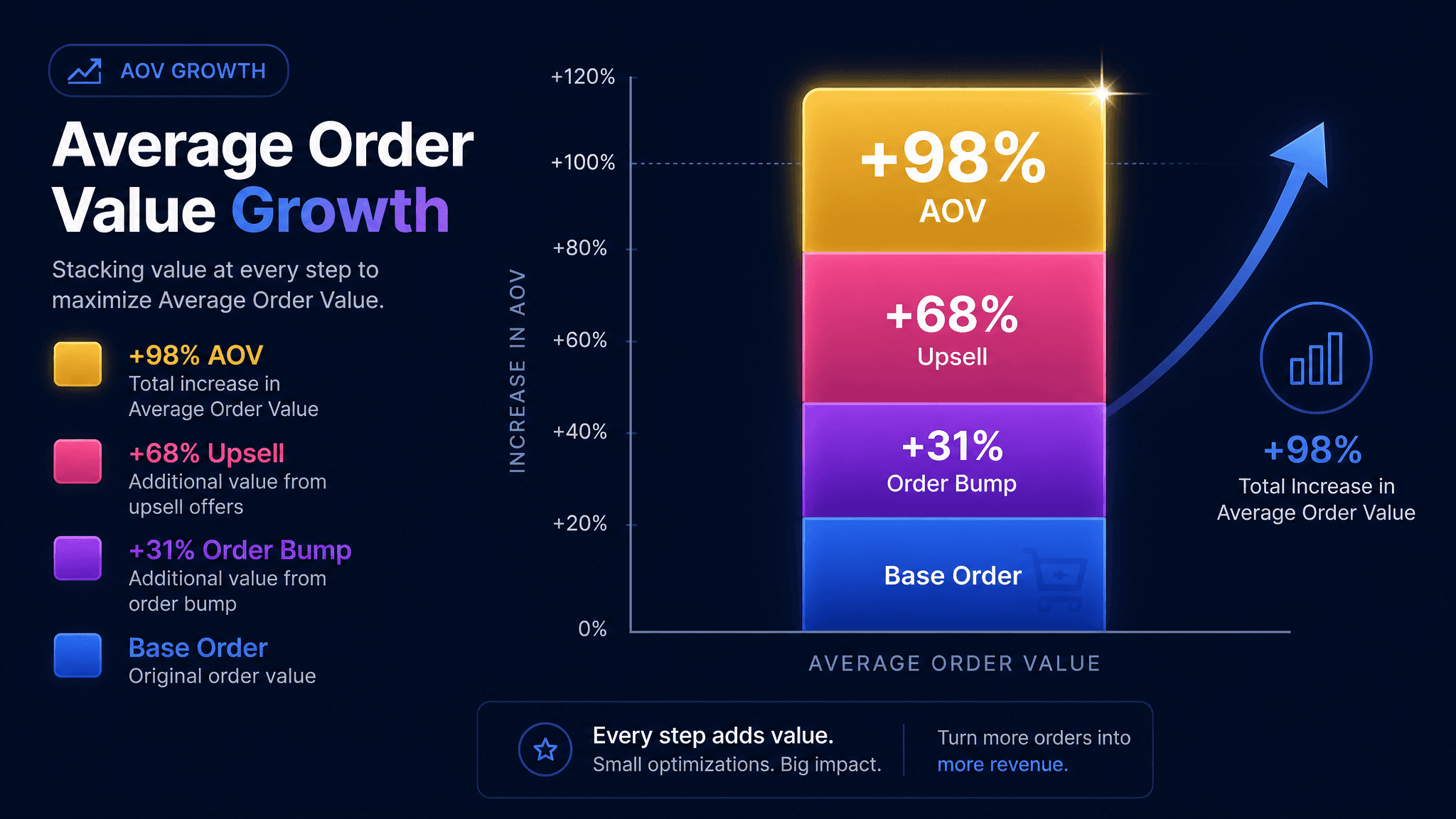
One SamCart seller ran a single-step checkout with one order bump and one post-purchase upsell. The order bump alone added 31% to average order value. Adding the upsell on top brought total AOV up 68% over the base offer. Combined, that seller's checkout produced a 98% increase in revenue per sale, without touching ad spend or traffic.
Separately, sellers who move from a multi-step, form-heavy checkout to a single page see conversion lifts in the 3-4x range compared to the industry average. That's the difference between a checkout that quietly loses money and one that pays for itself in the first week you switch.
Get a checkout built around these 9 changes
You don't need to rebuild your funnel to fix your checkout. SamCart's checkout is built around the changes in this post by default: single page, mobile-first, order bumps and upsells built in, and a completion time of about 8 seconds. See how SamCart's checkout compares or read the full breakdown of what an order bump adds to your revenue.
If you're still deciding on a platform, see how SamCart stacks up against Kajabi or read how to increase average order value for the bump-plus-upsell playbook in more detail.
SamCart Editorial Team
Brian Moran
Founder
Samara Lemon
VP of Marketing
Leilani Treuting
Marketing Director
Scott Moran
Co-Founder
Frequently Asked Questions
What is a good checkout conversion rate?
A good checkout conversion rate for digital products is typically 3-5%, though this varies by price point and traffic source. SamCart-built checkouts, optimized around the changes above, often land in the 3-4x range compared to industry averages, meaning a seller converting at 2% could realistically move toward 6-8%.
How long should a checkout page take to load?
A checkout page should load in under 2 seconds. Every additional second of load time increases the chance a buyer abandons before the form even appears, especially on mobile connections.
Should I use a one-page or multi-page checkout?
Use a one-page checkout whenever possible. Multi-page checkouts introduce extra load times and decision points, both of which increase abandonment. A single page with the product, price, and payment field all visible removes those exit points.
What's the difference between an order bump and an upsell?
An order bump is a one-click add-on offer shown on the checkout page itself, before the sale completes. An upsell is a related offer shown after the first purchase is complete. Both add revenue, but they work at different moments and shouldn't be confused with each other.
Do trust badges actually improve checkout conversions?
Yes, when placed near the payment field at the moment someone is about to enter their card details. Trust signals answer the "is this safe" hesitation at the exact point it happens, which is different from placing them elsewhere on the page where they don't address that specific moment of doubt.