
Landing Page Optimization: 12 Data-Backed Strategies That Double Conversions
Reading Time
10
Published On
Updated On

Brian Moran
Founder

Samara Lemon
VP of Marketing

Leilani Treuting
Marketing Director

Scott Moran
Co-Founder
SamCart is the digital business platform that builds, runs, and scales your online business. AI handles the hard parts, so you keep more of what you earn.

Table of Contents
Title
Share this article
Landing page optimization is the process of improving every element of your page to convert more visitors into buyers, subscribers, or leads. For digital product sellers specifically, optimization means stripping away distractions, matching your message to your traffic source, and structuring your page around the psychology of selling a transformation rather than a physical item.
Here's the problem most digital sellers run into: nearly all landing page advice on the internet is written for ecommerce stores selling physical products. The tips assume you have product photos, shipping details, size charts, and shopping carts. If you're selling a course, coaching program, membership, or digital download, that playbook doesn't apply. The conversion mechanics are fundamentally different when you're selling knowledge, outcomes, and access rather than a box that shows up on someone's doorstep. SamCart has processed over $7 billion in digital product transactions across 75,000+ businesses. The 12 strategies in this guide are drawn from what actually converts in the digital product space, backed by real sales data rather than recycled marketing theory.
Last updated: April 2026
That disconnect explains why so many digital sellers build landing pages that look "right" but don't convert. They follow advice meant for Amazon-style product pages, add trust badges and shipping guarantees that don't apply to them, and wonder why their conversion rate hovers around 1-2%.
This guide is different. Every strategy here comes from analyzing what works across real digital product pages, not hypothetical best practices borrowed from physical retail. If you sell courses, coaching, memberships, templates, or any kind of digital product, these are the 12 optimizations that actually move the needle.
What Is Landing Page Optimization (And Why Most Advice Is Wrong for Digital Sellers)?
Landing page optimization (LPO) is the systematic process of testing and improving your landing page elements to increase the percentage of visitors who take your desired action, whether that's buying, subscribing, or signing up.
The standard advice you'll find on most marketing blogs sounds reasonable: use contrasting CTA button colors, add trust badges, include free shipping messaging. But that advice assumes a very specific type of page and a very specific type of buyer.
Digital product buyers don't care about shipping speed. They can't hold your product in their hands. They're not comparing your widget against three other widgets. They're making a decision based on whether they believe your course, coaching program, or membership will deliver a specific outcome in their life or business.
That means digital product landing page optimization is really about three things: clarity of transformation (what will this do for me?), credibility of the seller (why should I trust you?), and reduction of friction (how easy is it to say yes?). Every strategy in this guide maps back to one of those three levers.
Landing Page Conversion Rate Benchmarks (By Product Type)
Before you optimize anything, you need to know what "good" looks like. The widely cited average landing page conversion rate across all industries is 2.35%, according to WordStream's analysis. But that number is nearly meaningless for digital product sellers because it blends ecommerce, SaaS, lead gen, and everything else into one average.
Here's what conversion rates actually look like by digital product type when pages are properly optimized:
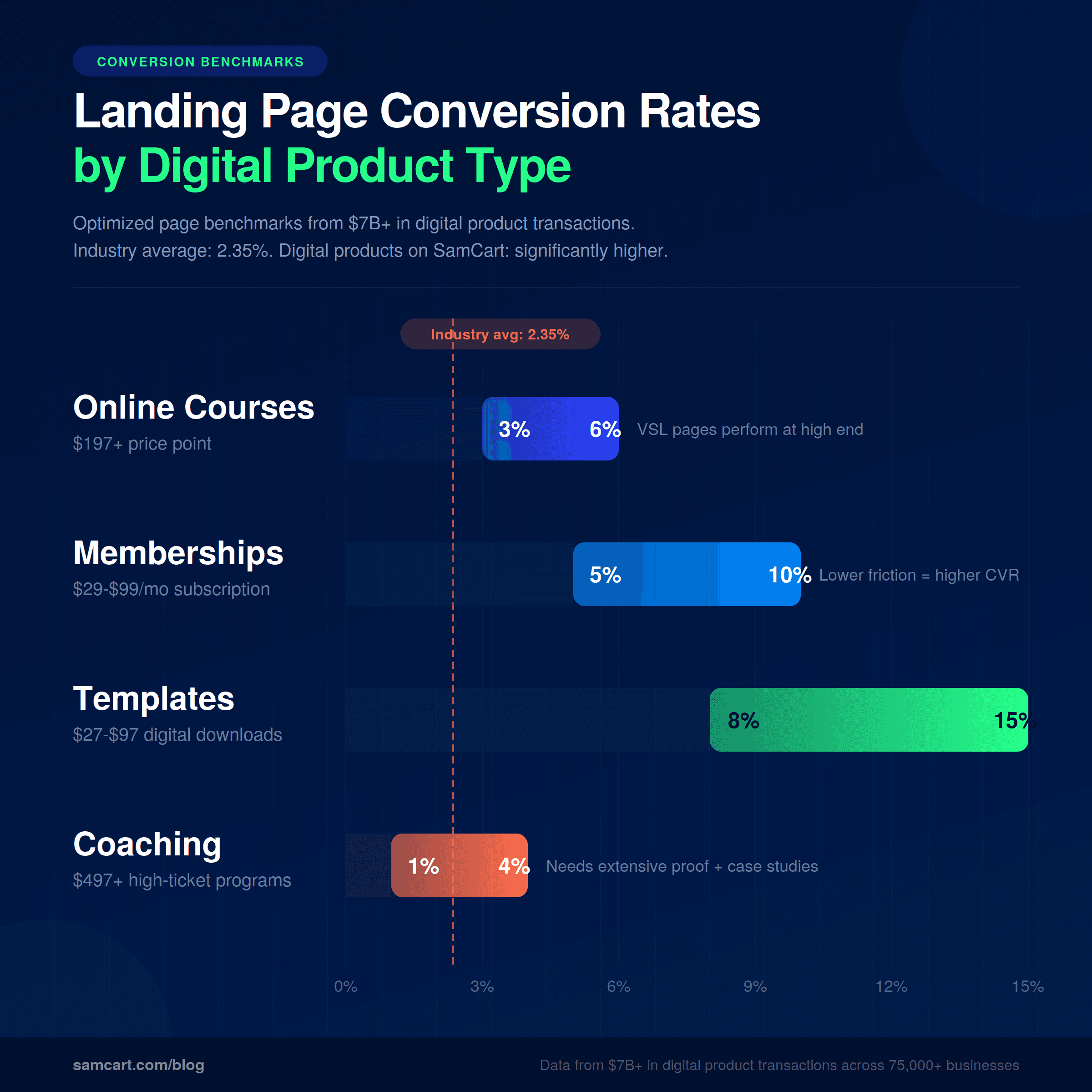
Online courses ($197+): 3-6% conversion rate. Higher-priced courses require longer pages with more social proof and a clear transformation narrative. Pages with video sales letters tend to perform at the higher end of this range.
Memberships and subscriptions ($29-$99/mo): 5-10% conversion rate. Lower monthly commitment reduces purchase anxiety. Pages that emphasize community, ongoing value, and easy cancellation convert highest.
Digital templates and downloads ($27-$97): 8-15% conversion rate. Low price point plus instant delivery equals lower friction. Short, benefit-focused pages outperform long-form sales pages at this price point.
Coaching programs ($497+): 1-4% conversion rate. High price means higher skepticism. These pages need extensive proof, often including case studies, video testimonials, and detailed curriculum breakdowns.
These ranges come from patterns across $7B+ in digital product transactions. Your specific numbers will depend on traffic quality, offer strength, and how well your page executes the strategies below. But if your conversion rate is significantly below these benchmarks, you have room to improve.
12 Landing Page Optimization Strategies That Actually Move the Needle
1. One Problem, One Solution, One CTA
The number one mistake on digital product landing pages is trying to do too much on a single page. Navigation bars, sidebar links, footer menus, multiple product options, blog links. Every element that isn't driving toward your single conversion goal is pulling attention away from it.
The best-converting landing pages solve one specific problem for one specific person. That's it.
Remove your navigation bar. Kill the sidebar. Eliminate footer links. If your landing page has more than one job, it has zero jobs. This is the 1:1 attention ratio principle: one page, one goal, one action for the visitor to take.
This is especially critical for digital product pages because you're already asking someone to trust an intangible purchase. Adding distractions makes that trust harder to build.
[VIDEO EMBED: "How to Build a One-Page Sales Site" (youtube.com/watch?v=3iU4a1yWGn0) — @brianmoran]
2. Match Your Headline to Your Traffic Source
When someone clicks an ad that says "sell courses online," they should land on a page where the headline says "sell courses online." Not "grow your online business." Not "the platform for creators." The exact words they clicked on.
This is called message match, and the data behind it is hard to ignore. Matched messaging between your traffic source and your landing page headline increases conversion by 25-40%. That's not a minor tweak. It's the difference between a 3% conversion rate and a 4-5% conversion rate on the same traffic.
For digital product sellers running paid ads, this means creating dedicated landing pages for each ad group rather than sending all traffic to a generic page. If your Facebook ad targets course creators, your landing page headline should speak directly to course creators. If your Google ad targets people searching "sell digital products," those words should appear above the fold.
Dynamic text replacement tools can automate this, but even manually creating 3-5 headline variations matched to your top traffic sources will produce significant gains.
3. Put Your CTA Above the Fold (Then Repeat It)
Your first call-to-action button should be visible without scrolling. Period. This doesn't mean your entire sales argument needs to fit above the fold. It means the option to act should always be available.
Then repeat your CTA after every major section. At minimum, your page should have a CTA at the top, in the middle, and at the bottom. For longer sales pages (common with digital products priced above $197), add a CTA after each key proof section.
The psychology here is simple: different visitors reach their decision point at different moments. Some are ready to buy after your headline. Others need to read every testimonial. Placing CTAs throughout the page ensures you catch each buyer at their moment of maximum conviction.
Every CTA button should use the same action-oriented language. "Start My Free Trial," "Get Instant Access," or "Join Now" outperform vague labels like "Submit" or "Learn More."
4. Social Proof That Doesn't Look Fake
Social proof is the single highest-impact element on a digital product landing page, because the buyer can't see or touch what they're purchasing. They're relying entirely on other people's experiences to judge whether the product delivers.
But generic social proof actively hurts conversion. "Great product!" with a stock photo avatar does nothing. It looks manufactured because it usually is.
[VIDEO EMBED: "This Landing Page Section Increased Conversions 30%+" (youtube.com/watch?v=qlsSo-Hmo6c) — @brianmoran]
What works: real names, real photos, real results. Screenshots of actual outcomes beat polished testimonial graphics. Specific numbers beat vague praise. "I made $12,000 in my first month using this system" is 10x more persuasive than "This changed my life!"
Landing pages with specific, verifiable social proof convert 2-3x higher than pages with generic or no social proof. That's not a small edge. It's the difference between a business that works and one that doesn't.
Stack your proof in multiple formats: written testimonials with names, video testimonials (even casual selfie-style), screenshots of results, logos of companies or publications that have featured you, and specific numbers (students enrolled, revenue generated, results achieved).
5. Video Sales Letters (The 60% Advantage)
Landing pages with video convert significantly higher than text-only pages, with some studies showing gains of 60% or more. For digital product sellers, video is especially powerful because it lets you demonstrate expertise and build trust in a way that text alone can't replicate.
But there are rules. For cold traffic (people who don't know you), keep your video under 90 seconds. Don't autoplay audio, which drives immediate bounces on mobile. And front-load the transformation: the first 10 seconds should show what life looks like after someone uses your product.
For warmer audiences and higher-priced products, longer video sales letters (7-15 minutes) can work extremely well because they allow you to build a complete narrative arc: problem, agitation, solution, proof, offer.
The key is matching video length to both your price point and your audience temperature. A $37 template doesn't need a 15-minute VSL. A $997 coaching program probably does.
6. Mobile-First Design (Not Mobile-Compatible)
Over 60% of web traffic now comes from mobile devices. For digital product sellers running social media ads, that number is often 70-80%. Yet most landing pages are still designed on a desktop and then "made responsive" as an afterthought.
Mobile-first means designing for the phone screen first, then adapting up to desktop. The practical implications are significant. Your CTA buttons need to be full-width with tap targets of at least 44 pixels. Your forms should have a maximum of three fields. Your layout needs to be thumb-friendly, meaning all critical actions are reachable with one hand.
Text that looks clean on desktop often becomes walls of unreadable content on mobile. Break paragraphs aggressively. Use larger font sizes (16px minimum for body text). And test your page on an actual phone before launching, not just in a browser's mobile preview mode.
7. Page Speed: The Invisible Conversion Killer
Every additional second of page load time costs approximately 7% in conversions, according to data from Google and Akamai. A page that loads in 5 seconds instead of 2 seconds has already lost roughly 21% of potential conversions before anyone reads a single word.
For digital product landing pages, the targets are: Largest Contentful Paint (LCP) under 2.5 seconds, and Cumulative Layout Shift (CLS) under 0.1. In practice, this means compressing all images to WebP format and keeping them under 100KB each, lazy loading any content below the fold, and minimizing third-party scripts.
The biggest offenders are usually uncompressed hero images, multiple tracking pixels, and embedded chat widgets. Audit your page with Google PageSpeed Insights and prioritize anything flagged as impacting LCP.
This is an area where most digital sellers leave money on the table because page speed is invisible. Your page can look perfect and still bleed conversions because it takes 4 seconds to load on a phone over cellular data.
8. Reduce Form Fields to the Absolute Minimum
Every form field you add is a friction point that reduces conversions. The data is stark: reducing form fields has been shown to lift conversions by up to 120% in some tests.
For lead capture (free downloads, webinar signups), ask for email only. If you absolutely need a first name for personalization, that's your maximum. For purchase pages, collect only what's necessary: name, email, and payment details.
Everything else, like phone numbers, company name, "how did you hear about us" dropdowns, and detailed addresses for digital products, can be collected after the conversion through progressive profiling. Ask for more information once someone has already committed, not as a barrier to commitment.
If you're selling a digital product online, there's no shipping address to collect. Take advantage of that inherent simplicity rather than adding unnecessary fields.
9. A/B Test Headlines First
Your headline drives roughly 80% of the decision to stay or bounce. That makes it the single highest-leverage element to test, and it's where you should focus your optimization efforts before touching anything else.
Test these variations against each other: benefit-driven headlines versus curiosity-driven headlines, headlines with specific numbers versus without, and question-format headlines versus statement-format headlines.
Headline A/B tests routinely produce conversion lifts of 27-104%, which dwarfs the impact of testing button colors, image choices, or layout changes. Yet most digital sellers spend their testing budget on low-impact elements and never systematically test their headlines.
Run each test for a minimum of two weeks or 1,000 visitors per variation, whichever comes first. Statistical significance matters. A test that "feels" like a winner after 50 visits means nothing.
10. Urgency and Scarcity (When It's Real)
Countdown timers placed near CTA buttons can produce conversion gains of up to 3x. But this only works when the deadline, limit, or scarcity is genuine.
Fake scarcity, like a countdown timer that resets when the page reloads, doesn't just fail. It actively destroys trust. In 2026, buyers are sophisticated enough to spot manufactured urgency, and once they do, you've lost them permanently.
Legitimate urgency options for digital product sellers include cohort-based enrollment windows (the course starts on a specific date), limited bonus availability (first 50 buyers get a bonus coaching call), early-bird pricing with a real deadline, and seasonal promotions tied to actual events.
If your product is truly evergreen with no natural deadlines, don't manufacture false ones. Focus on other conversion levers instead.
11. Price Anchoring and Tiered Options
Price anchoring is the practice of showing what your offer is worth relative to alternatives before revealing your actual price. This is where digital product sellers have a massive advantage over physical product sellers, because the "alternative" to a course or coaching program isn't another course. It's hiring a consultant, spending years figuring it out alone, or cobbling together free content that never gives you a complete system.
Frame the comparison: "A business consultant charges $300/hour. This entire program, including 12 modules and lifetime access, is a one-time investment of $497."
Tiered pricing (Good/Better/Best) also lifts conversion because it shifts the decision from "should I buy?" to "which option should I choose?" Anchor with the premium option first to make the middle tier feel like a reasonable deal.
12. The Thank-You Page Upsell
The thank-you page is the most underutilized real estate in digital commerce. A buyer just completed a purchase. Their credit card is out. Their trust is at its peak. And most sellers show them a plain "thanks for your order" message and walk away.
This is where one-click upsells and order bumps change the math of your business. SamCart data shows that one-click upsells increase average order value by 68%. Pre-purchase order bumps convert at 30-40%.
That means a $47 product with a well-placed order bump and one-click upsell can generate an average order value north of $100, without acquiring a single additional visitor. For more on this, see our full guide on how to increase average order value.
The strategy is simple: after someone buys your core product, offer a complementary product or upgrade with a single click. No re-entering payment details. No second checkout process. One click, one upgrade, significantly more revenue per customer.
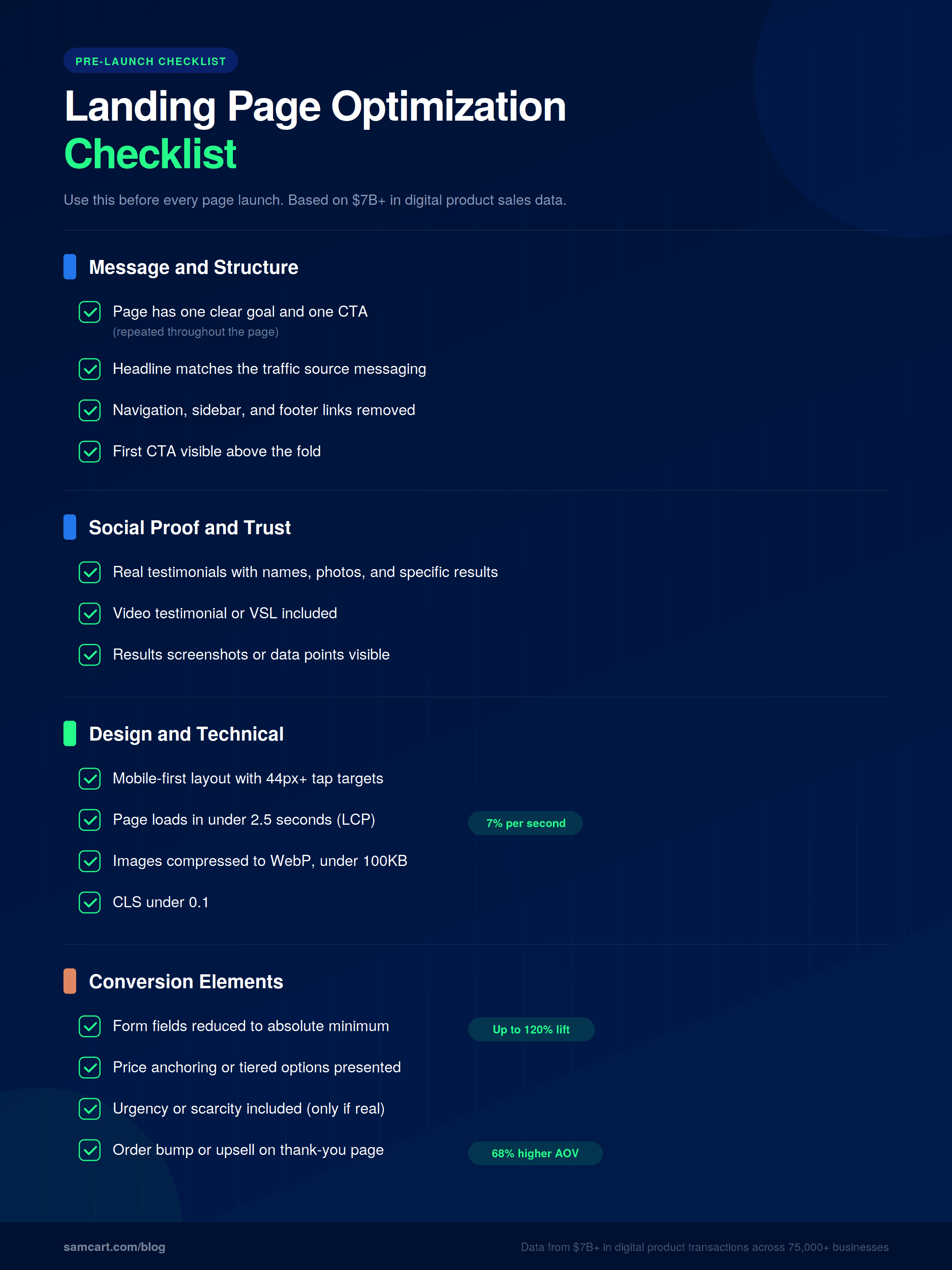
Landing Page Optimization Checklist
Use this before every page launch:
How Do the Best Landing Page Builders for Digital Products Compare?
Not all landing page builders are created equal, especially for digital product sellers. Here's how the major options compare:
Feature | SamCart | Unbounce | Leadpages | ClickFunnels | Instapage |
|---|---|---|---|---|---|
Built for digital products | Yes | No (general purpose) | No (general purpose) | Partial | No (enterprise focus) |
AI builds pages from product description | Yes | No | No | No | No |
AI trained on real conversion data | Yes ($7B+ in transactions) | No | No | No | No |
One-click upsells built in | Yes | No | No | Yes | No |
Order bumps built in | Yes | No | No | Yes (limited) | No |
A/B testing | Yes | Yes (core feature) | Yes | Yes | Yes |
Checkout built in | Yes | No | No | Yes | No |
Starting price | $99/mo | $49/mo | $147/mo | $79/mo |
The key distinction: most landing page builders give you templates and a drag-and-drop editor. You still have to write the copy, choose the layout, and figure out what converts. SamCart's AI builds your entire page from a product description, trained on what actually converts across 75,000+ real digital product businesses and $7B+ in transaction data. It's the difference between a blank canvas and a page that's already optimized before you publish it.
5 Common Landing Page Mistakes (And What to Do Instead)
Keeping navigation links on the page. Every link that doesn't point to your CTA is an exit. Remove your main site navigation, sidebar content, and footer links. Your landing page is not your website. It's a conversion tool with a single purpose.
Multiple CTAs competing for attention. "Buy now," "watch the webinar," "download the free guide," and "follow us on Instagram" on the same page. Pick one action. Drive everything toward it.
Designing for desktop and hoping mobile works. Previewing your page in Chrome's responsive mode is not a mobile test. Load it on an actual phone. Tap the buttons with your thumb. Fill out the form on a small screen. You'll find problems you never would have caught otherwise.
Slow page speed that nobody notices. Your page could be beautiful and still lose 20% of visitors because it takes 4 seconds to load on mobile data. Run PageSpeed Insights. Compress your images. Cut unnecessary scripts.
Generic stock photos instead of real proof. A smiling person at a laptop doesn't build trust. Screenshots of real results, photos of real customers, and specific data points do. If you don't have customer photos yet, use screenshots of your product, your results, or your process.
Start Optimizing Your Landing Pages Today
Every one of these 12 strategies is proven to move the needle on digital product landing pages. But here's the truth: most sellers never implement more than two or three of them because building and optimizing landing pages is time-consuming, technical, and requires constant iteration.
That's exactly why SamCart built an AI that creates landing pages from a product description, trained on $7B+ in real digital product sales data. Instead of staring at a blank template and guessing what converts, you describe your product and the AI builds a page that's already optimized based on what's worked across 75,000+ real businesses.
You can also use the Creator Revenue Calculator to see how optimized pages, upsells, and order bumps would impact your specific revenue numbers.
Ready to see what an optimized landing page looks like? Start your free trial and watch SamCart's AI build your page in minutes, not days.
SamCart Editorial Team
Brian Moran
Founder
Samara Lemon
VP of Marketing
Leilani Treuting
Marketing Director
Scott Moran
Co-Founder
Frequently Asked Questions
What's a good landing page conversion rate for digital products?
It depends on your product type and price point. Online courses priced above $197 typically convert at 3-6%, memberships at 5-10%, digital templates at 8-15%, and coaching programs at 1-4%. These ranges reflect optimized pages. If you're significantly below these benchmarks, the 12 strategies above will help close the gap.
How long should a landing page be?
Match length to price and complexity. Low-priced digital products ($27-$97) convert best with shorter pages that focus on benefits and a clear CTA. High-priced products ($497+) need longer pages with extensive social proof, detailed breakdowns, and a complete transformation narrative. There's no universal "right" length, only the right amount of information to get your specific buyer to say yes.
Should I use video on my landing page?
Yes, in nearly every case. Pages with video convert significantly higher than text-only pages. For cold traffic, keep video under 90 seconds. For warm traffic and higher-priced products, longer video sales letters (7-15 minutes) can be effective. Never autoplay audio, and make sure your page still converts without video for visitors who won't press play.
How often should I A/B test my landing page?
Run tests continuously, but focus on high-impact elements first. Start with headlines (80% of the stay-or-bounce decision), then test CTA copy, then social proof placement, then visual elements. Run each test for at least two weeks or 1,000 visitors per variation to reach statistical significance. Testing button colors before testing headlines is a waste of traffic.
What's the difference between a landing page and a sales page?
A landing page is any page designed to convert visitors on a single action, whether that's capturing an email, registering for a webinar, or making a purchase. A sales page is a specific type of landing page designed to sell a product. All sales pages are landing pages, but not all landing pages are sales pages. For digital products, the terms are often used interchangeably because the page's primary job is almost always to drive a purchase or signup.
Do I need a separate landing page for each product?
Yes. Each product should have its own dedicated landing page with messaging tailored to the specific buyer and the specific problem that product solves. Sending traffic to a general page with multiple products forces the visitor to choose, which reduces conversions. One product, one page, one CTA.


