Best Landing Page Examples to Use as Inspiration
Published On
Updated On

Brian Moran
Founder

Samara Lemon
VP of Marketing

Leilani Treuting
Marketing Director

Scott Moran
Co-Founder
SamCart is the digital business platform that builds, runs, and scales your online business. AI handles the hard parts, so you keep more of what you earn.

Table of Contents
Title
Share this article
A landing page is a focused, action-oriented web page designed to guide visitors through the buyer journey and drive them to complete a specific action.
Creating landing pages that convert requires strategic thinking and optimization expertise. That's why partnering with a provider who understands conversion rate optimization and has the tools to build high-converting pages delivers immediate ROI.
In this article, we'll examine the best landing page examples that drive real results for these businesses. First, let's unpack what makes an effective landing page:
What Makes an Effective Landing Page?
The secret to creating a remarkable landing page is laser-focus on a single task: convincing page visitors to click your CTA button and complete your desired action.
To drive those clicks and conversions, you need to deliver a clear message that instantly communicates the value of your offer. Here are the key elements to creating landing pages that convert:
A Title that Catches the Eye
To craft compelling page copy that converts, you need to use persuasive language that instantly connects with your target audience - whether that's highlighting pain points, showcasing benefits, or telling a compelling story.
Think of your headline as the door to your offer. A compelling, eye-catching title invites visitors in and drives them to explore further. That's why investing time in headline optimization delivers immediate ROI.
All your design efforts and optimization work can be completely wasted with a weak headline that doesn’t immediately capture attention.
Keep it Concise
Be clear and avoid complex sentences and long paragraphs. The best option is to show concise information using visuals, bullet points, or short paragraphs with subtitles.
It is crucial to have one landing page dedicated to each service or product with its own CTA button. This will help you focus and explain the benefits clearly and concisely.
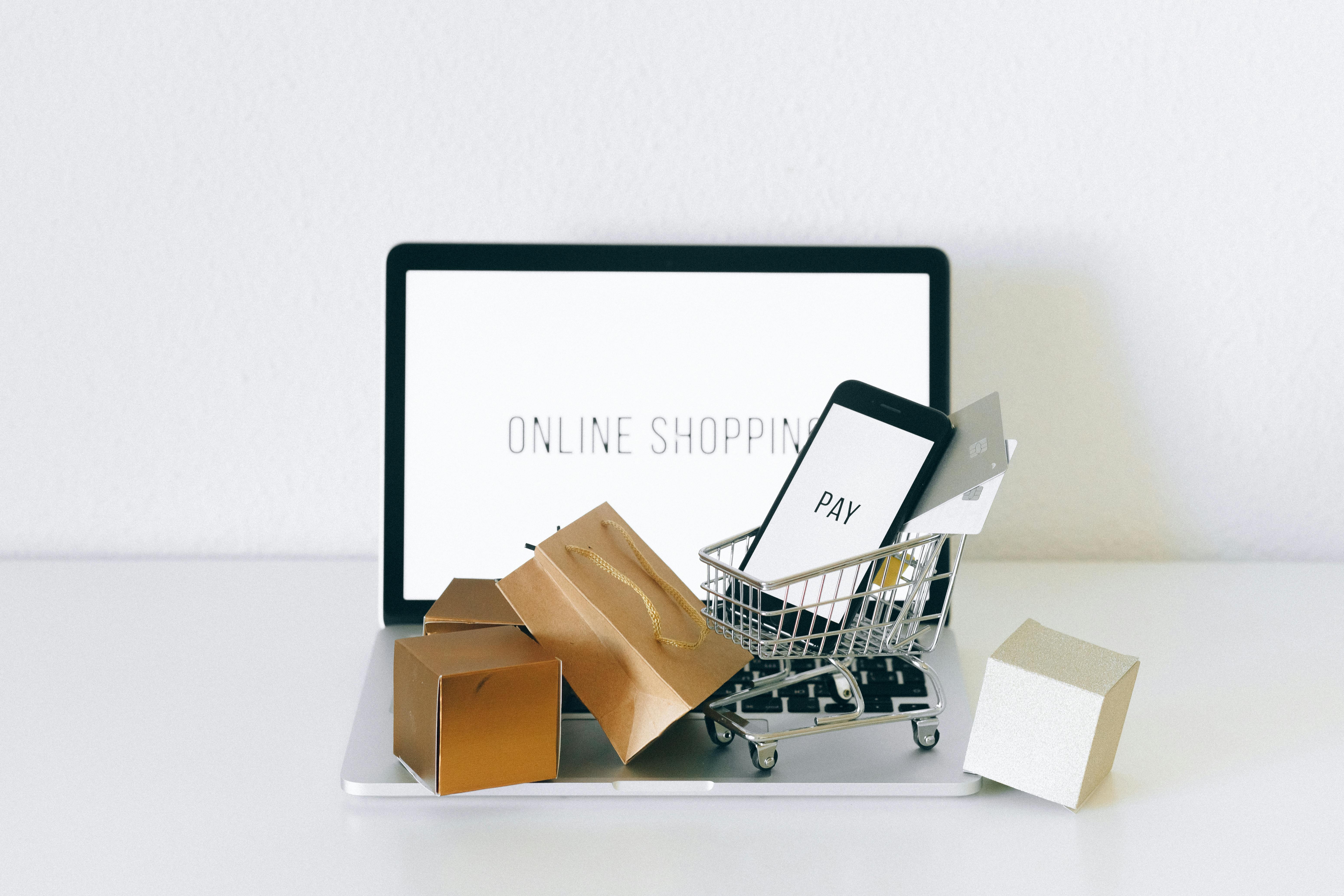
Eye-Popping Visuals
People are typically more attracted by strong visuals than by text. Choose eye-catching images and graphics, such as videos, animations, and infographics, that illustrate your offer.
High-quality visuals is one of your best allies in showcasing your benefits and values. The digital world favors images, and you can often tell a story better without words.
Videos or animations create connection faster and engage people more quickly.
Fast Loading Speed
The longer a landing page takes to load, the more potential customers it will lose. Visuals can slow down page loading time, so you need to balance great visuals and a fast loading speed.
A fast loading speed ensures smooth browsing and UX. Nothing increases page abandonment faster than slow page loading. Be sure to optimize and test the time it takes your landing page to load.
Use Trust Signals
There are several ways to build trust with your page visitors quickly. Some include:
Providing your contact information, including email, phone number, address, and chat option.. By clearly and visibly showing a way for people to get in touch with you or your team, you can inspire security.
Sharing customer experiences and reviews. Include testimonials, case studies, and reviews to build trust and credibility quickly.
Establishing refund policies increases confidence and reduces hesitation to buy.
A Call to Action that Can't Be Ignored
A Call to Action is the main purpose of a landing page. A well-crafted CTA has the power to get someone to take action immediately. The words used, placement on the page, and color all are important considerations for your CTA.
Go beyond the usual general approach most CTAs take, such as “Download Now” or “GetDiscount,” and make them more personal: “Download your E-Book,” “Get my discount.” Test CTAs to see what works the best. Driving urgency, scarcity, and personalization works best.
Mobile Responsiveness
Most views of your landing page will come from mobile devices.Mobile devices are everywhere. Thus, your digital content and marketing campaigns must be mobile-responsive.
Mobile responsiveness adapts your digital content to screen sizes. Images, text, and layouts will be automatically presented in the right format for reading on a desk, tablet, or mobile device.
Being mobile-friendly also helps to improve user experience and SEO ranking, and allows you to reduce bounce rates.
7 Landing Page Examples to Learn From
Below are some of the best landing page examples across industries, showcasing what makes them effective in eCommerce and other business sectors. Let's take a look at the elements that make them a good example:
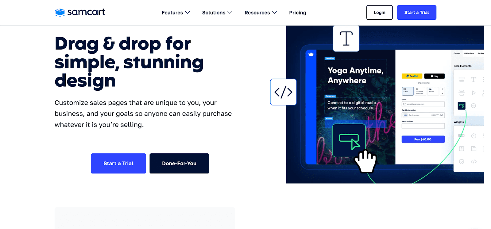
1. SamCart (eCommerce/Checkout Optimization)
SamCart is a conversion-focused checkout platform that helps businesses optimize sales. Their landing page uses:
Strategic CTA placement: SamCart positions their call-to-action buttons precisely where visitors are most likely to click after consuming key information, rather than randomly throughout the page.
Conversion-focused messaging: Their landing page focuses on specific results (like “Double Your Average Order Value”) rather than vague benefits, showing a clear understanding of what motivates their target audience.
Social proof integration: SamCart strategically showcases real customer success stories and metrics (77,000+ businesses, $4+ billion processed) at key decision points to build immediate credibility.
Friction-free design: Their page eliminates distractions and unnecessary navigation options, creating a focused path to conversion without overwhelming visitors with choices.
Value-first approach: Instead of leading with features, SamCart's landing page emphasizes how their solution solves specific pain points like cart abandonment and complex checkout processes.
Mobile optimization: Their landing page delivers a perfect experience across all devices without compromising functionality or visual impact.
SamCart provides ready-to-use landing page templates designed to maximize conversions, allowing businesses to quickly create optimized pages that seamlessly integrate with their checkout process.
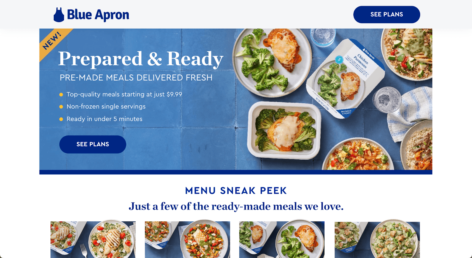
2. Blue Apron (Subscription/eCommerce)
Blue Apron, a meal kit delivery service, creates a landing page that immediately draws users in with:
High-quality food photography to build an emotional connection.
A minimalist design emphasizing value, flexibility, and convenience.
Easy sign-up options to convert visitors quickly.
A color pallet aligned with the brand identity.
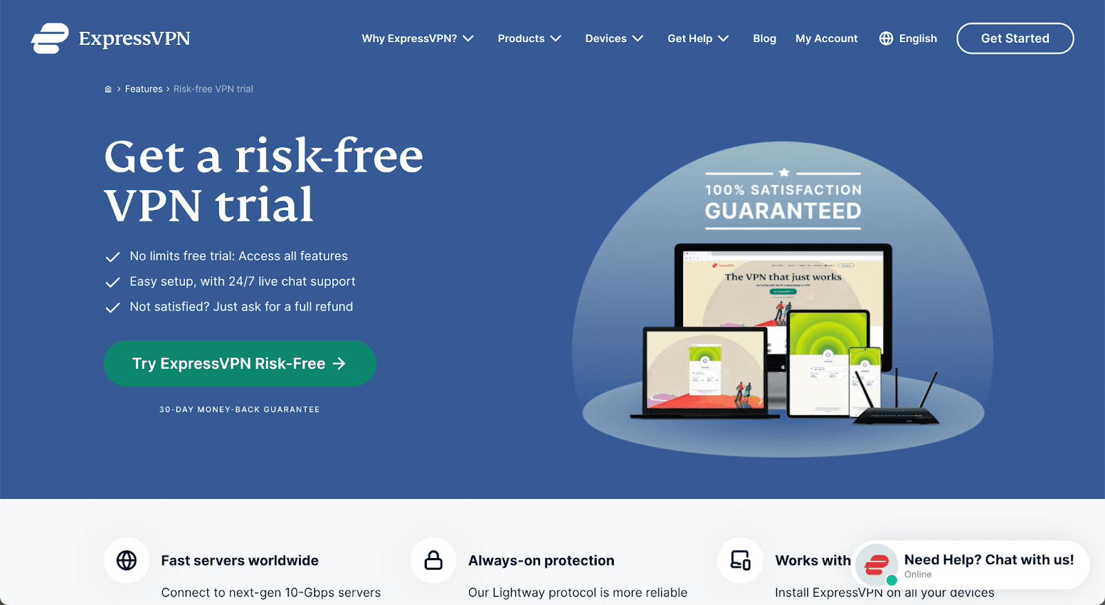
3. ExpressVPN (Tech & Security)
ExpressVPN's landing page effectively sells its security service by:
A friendly image to engage and connect with the audience.
Live option to provide support.
Fast-loading and easy navigation, ensuring a frictionless experience.
To convey the main product's benefits clearly.
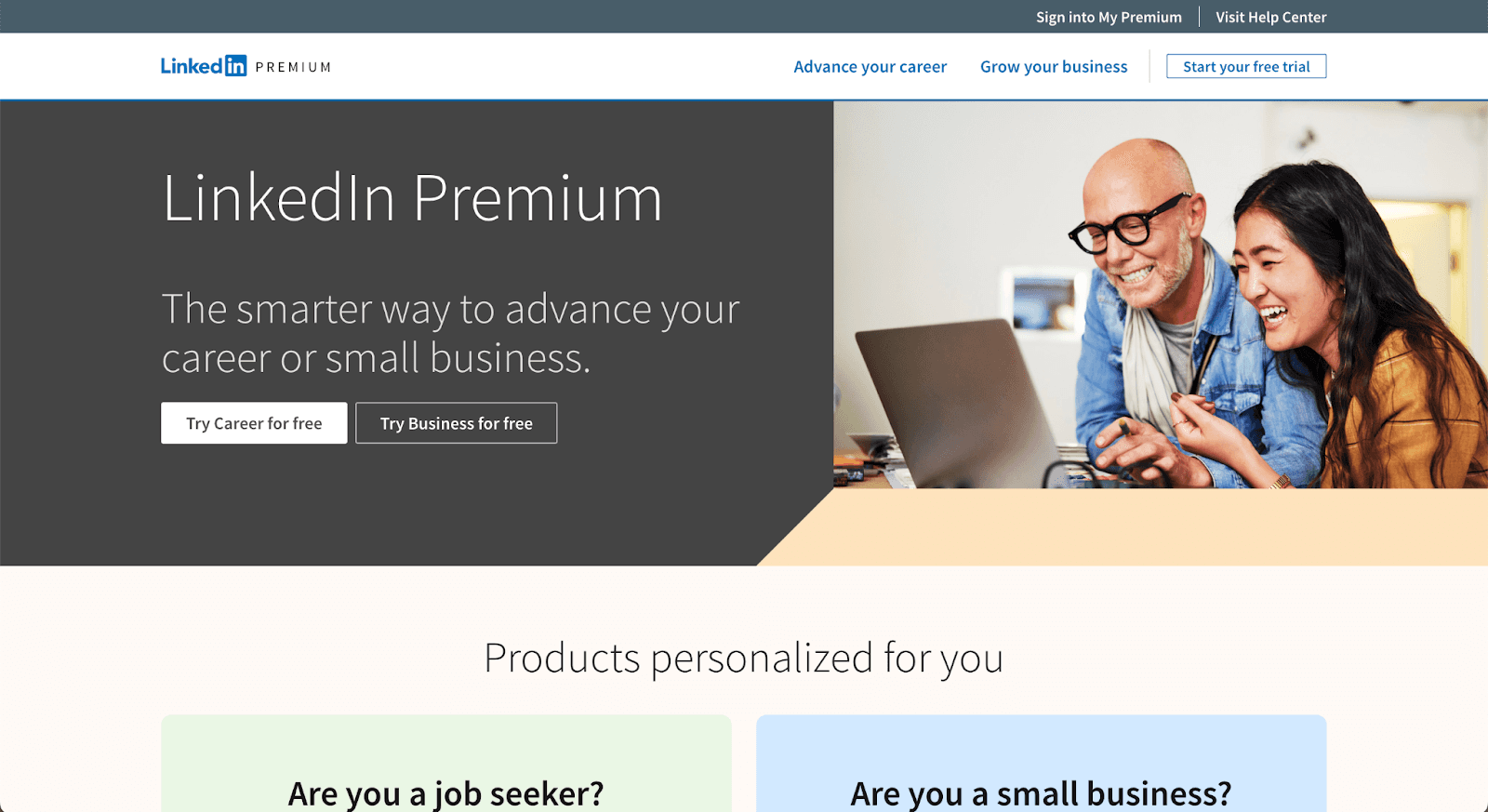
4. LinkedIn Ads (B2B Marketing)
LinkedIn's landing page is designed to convert businesses into advertisers by:
Featuring a fixed CTA button that stays visible while scrolling.
Autofill the process by signing in with a LinkedIn account.
Simplifying the ad creation process in an easy-to-follow format.
To offer inbound content and a discount at the same time.
5. Intercom (Customer Service & AI)
Intercom, an AI-powered customer service platform, creates an effective landing page by:
Leveraging data and statistics to validate its claims.
Using trust badges and testimonials to increase credibility.
A straightforward layout that guides users toward sign-ups.
Minimalist and modern look to highlight the content.
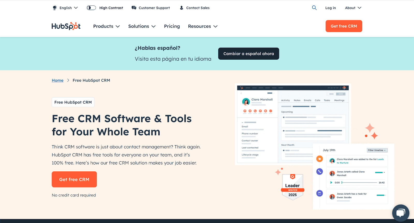
6. Hubspot
Hubspot has a well-crafted and well-designed landing page. You can find in this example:
A highlighted and bold color for the main CTA.
Live chat option for asking general questions about the product.
Texts and images are well organized.
A badge that shows authority and credibility.
7. Masterclasses
Masterclass also has one of the best examples of landing page models. You can find the following elements:
Social platform icons where visitors can follow your content.
Size fonts organized on the copy page to guide to the CTA.
A bold CTA to invite the visitors to complete the action.
Photography that shows authority and reinforces the brand position.

What Are the Best Practices for Landing Page Design?
Let's dive into the battle-tested practices for building landing pages that convert casual browsers into eager buyers:
Keep It Focused on a Clear Objective
When creating a landing page, you must ask yourself: "What do you want visitors to do when they land on the page?". The answer can be to have them fill out a signup form with their contact information or to have them make a purchase. Either way, having a clear answer will help you guide the process of building the content and visuals for your landing page. Everything on that page should lead back to getting visitors to take that one action.
Show Consistency with your Brand Identity
Make sure that the landing page's color palette and design elements match your website and homepage.. A landing page is usually the first thing a visitor sees, so you should ensure its visuals align with your brand's identity.
Don't Be Afraid to Use White Space
Avoid clutter and a page with too many distractions. Some white With the right amount of white space, it will be easier to draw attention and highlight relevant headers and CTAs.
Optimize Through A/B Testing
A/B testing is one of the best ways to find out what works and boost conversions. You should A/B test headlines, CTAs, and anything else you can think of.
Testing allows you to optimize your landing page based on customer data rather than assumptions. If you invest time in doing this, your conversion rates will reflect it, and your landing pages will be significantly more effective.
SamCart's A/B testing capabilities empower creators to optimize landing and sales pages by comparing different versions to see which converts better. Their platform allows you to easily test headlines, CTAs, pricing displays, and page layouts, with real-time analytics tracking which variation drives higher conversion rates.
Check Your Performance Analytics
Checking your landing page's metrics can help you make adjustments and improvements. All the data you collect, such as traffic sources, conversion rate, time on page, and bounce rate, should be analyzed so you can make changes.
For example, if you see bounce rate metrics are increasing, you can A/B test headlines to see if a different headline version keeps visitors on page longer.
SamCart's conversion tracking and analytics services provide real-time visibility into your sales funnel performance.
These high-converting landing page examples deliver real-world results you can implement immediately to boost your eCommerce business.
By applying these proven strategies, you'll capture more leads, drive higher conversion rates, and maximize ROI from every marketing campaign. The digital world moves fast—standout landing pages give you the competitive edge.
Today's customers demand engaging, value-focused content that speaks directly to their needs. Creating high-converting landing pages instantly expands your business reach and connects with your target audience.
As an online seller, you need marketing tools that transform browsers into buyers. Design your high-converting landing page with SamCart in just minutes. Our sales page templates are built specifically for digital product sellers, course creators, and online entrepreneurs.
Create conversion-focused pages and boost sales by 30% or more with SamCart’s checkout platform that completes purchases in as little as 8 seconds. Get started now.
SamCart Editorial Team
Brian Moran
Founder
Samara Lemon
VP of Marketing
Leilani Treuting
Marketing Director
Scott Moran
Co-Founder
Frequently Asked Questions
Do I need a landing page?
If you have an online or physical business with a website, you definitely should have a landing page. The main purpose of the landing page is to encourage users to take action, such as buying a product, booking a demo, or signing up for an email list.
A landing page will help you convert all traffic to your website, whether leads or new customers.
What content should I display on my landing page?
Some of the key elements that every landing page should have include:
A clear and concise headline that contains the main keyword at the top of the page
A brief description of the offer (product, service, etc.)
A strong CTA that can be represented by a CTA button or sign-up form
Testimonials or reviews that function as social proof and trust elements
A contact form where you can get the customer's email, phone numbers, or other specific information.
What's the difference between a landing page and a home page?
The home page is a business's main page of their website in the digital world. Its goal is to tell visitors about the business and offerings; however, it not intended to drive all visitors to take a specific action.
A landing page is focused on guiding the target audience to specific actions. That action can be purchasing an offer, opting into something, or some other action, achieved through a CTA button
Therefore the copywriting will be different on a homepage versus a landing page.
What should I avoid displaying on my landing page?
Avoid providing too much information and overwhelming the page visitor. Too much text hides the main message. Be clear and concise to communicate effectively andUse images and videos strategically to visually tell a story.
Should I have testimonies on my landing page?
Landing pages that contain testimonies allow you to build trust in your brand and offer. Each testimonial is proof that someone has used your product or service and that it worked.
Use testimonials as direct quotes or through case study videos. This helps you boost credibility, reduce hesitation, and increase your conversion rates.