
An Interview with Senior Designer Kylen Higgins on SamCart’s Brand Evolution
Published On
Updated On

Brian Moran
Founder

Samara Lemon
VP of Marketing

Leilani Treuting
Marketing Director

Scott Moran
Co-Founder
SamCart is the digital business platform that builds, runs, and scales your online business. AI handles the hard parts, so you keep more of what you earn.

Table of Contents
Title
Share this article
Senior Graphic & Web Designer Kylen Higgins was recently at the helm of SamCart’s brand evolution, updating brand colors, typefaces, and other design elements.
While our updated website brings her vision to life, countless hours were invested behind the scene to not only update SamCart’s look and feel, but reestablish the brand in the marketplace of eCommerce platforms.
This new and improved branding release coincided with the launch of a number of exciting checkout-centric and conversion-boosting features for SamCart customers, who are predominantly sellers of digital products and services.
Keep reading to learn more about Kylen’s design processes and philosophies and what’s next for SamCart as a brand!
SamCart looks a little different than it used to! Why was it important to evolve SamCart’s branding?
The company as a whole is really evolving, including what our product does and the value it brings to our customers.
With our latest feature launch, we wanted to have alignment and present ourselves to the market as who SamCart is today. We conducted in-depth market research and determined that there were many attributes of our brand that were hitting the nail on the head, in addition to attributes that needed refinement.
While who we are at our core has not changed, it was time for us to develop a visual identity that positions us more accurately as an innovative platform that is pushing the boundaries and reaffirms our commitment to the success of digital creators.
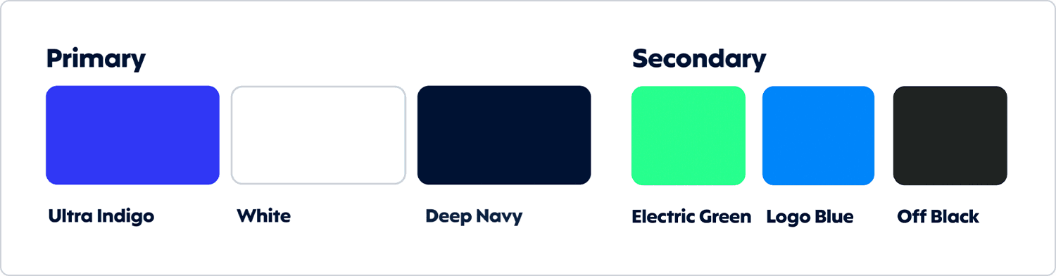
SamCart’s brand colors changed as part of the brand evolution. What was your philosophy behind the new color palette?
What we knew we didn’t want to do was to start back at square one and abandon the brand completely. We viewed this as an opportunity to evolve and refresh as opposed to rebrand, which can have a lot of negative impacts if it’s not necessary.
Blue has always been a huge part of our brand identity, and we knew we wanted to maintain it in some capacity. Blue is known to symbolize trust and stability, which is key to our brand and definitely what we still want to evoke. The new blues we chose are more bold and confident and therefore represent our growth.
Bringing in a new secondary color was also an opportunity for us to break new ground and really lean into our evolution as a brand. We ultimately landed on green, given that it works harmoniously with blue and represents prosperity, growth, and security. The vibrance of the green we chose is intentional and representative of innovation and the new energy being infused into our brand.
We are creators at our roots and are committed to being creative and forward-thinking and so our color palette had to align more closely with those qualities.
What was it like to partner this brand evolution with a huge launch of new features? Do you feel that one helped inform the other?
Daunting! In all seriousness, it truly provided the purpose and inspiration for the brand evolution. We have this brand new suite of features that are innovative and game-changing for so many creators, so we needed to match that from the brand side of things, too.
Our product team sets the bar extremely high and it was imperative to communicate visually that, more than ever, we are committed to enabling digital sellers to be as successful as they can be.
What was the most challenging part of this process?
The most challenging part was determining how our visual language could communicate all of our brand attributes: our mission, values, and personality. Our mission is to be the industry-leading eCommerce platform for digital creators and brands. By making enterprise-level tools accessible and easy to use, we enable sellers to exceed their expectations and realize their full potential.
We do this through trusted, confident, straightforward, and approachable communication, both visually and verbally. Every brand decision was rooted in these attributes and there is not a component of the new brand that doesn’t correlate to these foundational elements, from our color palette to our fonts and to small details like whether we use rounded or square corners.
Logos, colors, and fonts are really just those things until they are used purposefully and cohesively. This design approach is not easy but wins time and time again when building a brand that people connect with. And that’s what we’re all about at SamCart.

What do you think is next for SamCart?
We have some really exciting features coming down the pipe that will continue to change the landscape for digital sellers. We are a team of innovators and problem solvers at our core and I’m excited to see what the future holds, because it’s going to be great!
And finally: What’s your favorite thing about working at SamCart?
So hard to choose just one!
I would have to say that my absolute favorite part is the people. We hold ourselves to our values every day - Be an Owner, Be Human, Be You, Be Creative & Commit, and Be Transparent.
We are truly a group of people that have no egos and can openly and honestly challenge one another to make sure that we are producing the absolute best work possible. This really comes from the top down and I am so dang inspired on a daily basis by the people around me.
------------------
Check out Kylen’s work at www.samcart.com.
Want to see what all the hype is about from our new feature launches and fresh brand updates? Start a free trial.
SamCart Editorial Team
Brian Moran
Founder
Samara Lemon
VP of Marketing
Leilani Treuting
Marketing Director
Scott Moran
Co-Founder


