
Best Landing Page Examples: 8 Elements Every High-Converting Page Shares
Reading Time
10
Published On
Updated On

Brian Moran
Founder

Samara Lemon
VP of Marketing

Leilani Treuting
Marketing Director

Scott Moran
Co-Founder
SamCart is the digital business platform that builds, runs, and scales your online business. AI handles the hard parts, so you keep more of what you earn.
Table of Contents
Title
Share this article
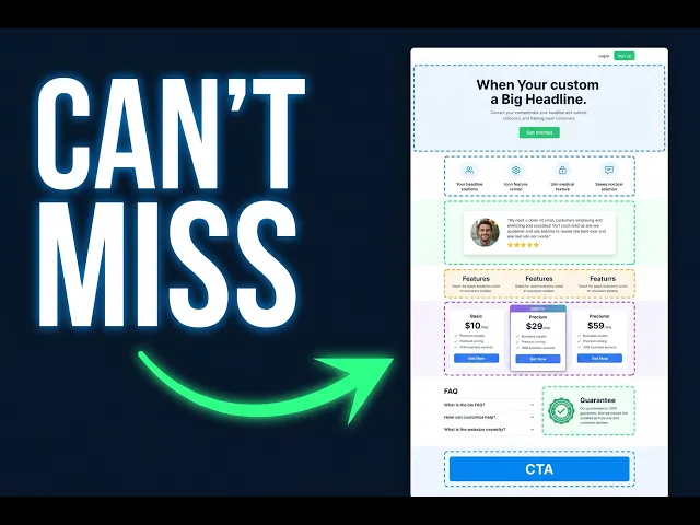
The best landing page examples all share the same eight elements, regardless of niche, price point, or product type. A strong promise headline, a qualifying subheadline, a hero visual that shows the outcome, three to five benefit bullets, social proof, a clear offer with one CTA, a risk reversal, and a conversion-focused FAQ. Miss even one, and you leave sales on the table.
At SamCart, we've processed over $7 billion in sales across 75,000+ businesses and 140 million orders. When you watch that much money move through landing pages, patterns stop being opinions and start being data. Every high-converting page we've seen in fitness, business education, finance, coaching, and digital products runs the same eight-element framework. The pages that skip elements don't just underperform. They fail.
Most landing pages fail before a visitor even reads the second line. Not because the product is wrong. Not because the price is too high. Because the page doesn't make a fast, specific promise, and the visitor leaves to find someone who does. This guide breaks down every element of the best landing pages we've studied, with real examples from creators across niches, so you can build a page that actually closes.
What Makes a Landing Page "High-Converting"?
A high-converting landing page is a focused, single-offer page whose only job is to build the case for one purchase. Not a homepage. Not a product catalog. One offer, one argument, built brick by brick.
The best landing page examples share a measurable trait: they move a visitor from "what is this?" to "I need this" in a predictable sequence. That sequence has eight steps. Every element below corresponds to one step in that sequence. Skip a step and you break the momentum that carries someone to the buy button.
The 8 Elements Every High-Converting Landing Page Needs
Element 1: The Promise Headline
The headline at the top of your page is the most important piece of real estate on the entire page. It is not your product name. It is not your company name. It is a specific promise: one outcome the visitor gets if they buy.
You have about three seconds. If the promise isn't clear in three seconds, the visitor leaves.
The strongest landing page headlines follow a simple formula:
Get [specific outcome] in [specific time], without [biggest objection].
Real examples of this in action:
A golf training product: "Finally Fix Your Swing" (specific outcome, implies speed, removes the frustration of vague instruction)
A physical product: "Crystal Clear Ice Cubes, Every Time" (specific outcome, zero ambiguity)
A marketing certification from Digital Marketer: "Master Your Craft" (outcome-first, niche-specific)
Notice what none of these do: they don't lead with the product name, a tagline, or a generic welcome message. Every one of them earns the next scroll.
Element 2: The Subheadline
The subheadline answers two questions: who is this for, and how fast do they get the result?
Its job is to make the right visitor think "this was built for me." The best subheadlines use what copywriters call the "without" formula. Every pain point you name is an objection you've removed before the visitor had a chance to think it.
Example: "How to build a team of AI agents without hiring developers, getting hacked, or spending a fortune on tokens."
Three objections, one sentence, done. If you sell to someone who's worried about all three of those things, they're not going anywhere.
Subheadline formula: How to get [benefit], without [pain 1], [pain 2], or [pain 3].
Element 3: The Hero Visual
The hero visual is the image or video right next to your headline. It should show one of two things: the product itself, or the transformation the product delivers.
The best landing pages match the visual to the emotional outcome in the headline.
Fitness brands show before/after results
Event pages show a packed room buzzing with energy
Digital product sellers show a mockup of the ebook or a preview inside the course
Course creators show the transformation their students experience
Lewis Howes showing the physical cover of his book with his energy front and center. Codie Sanchez using a high-energy event video background. Taking Cara Babies showing a sleeping newborn, the exact emotion sleep-deprived parents are desperate to feel.
The hero visual connects the dots the headline started. When a visitor sees an image that mirrors exactly what they want, they stop bouncing and start reading.
Element 4: Points of Discovery (Your Benefit Bullets)
Points of Discovery are three to five bullet points that each describe a specific outcome your product delivers. Not features. Not what's included. Outcomes.
The most common mistake on landing pages: describing the product instead of selling it.
Weak bullets tell people what they get:
8 training videos
4 downloadable worksheets
6 weeks of live coaching calls
Strong bullets show people what those things do for them:
For a baseball training course:
How to add power to your swing no matter how big you are
The 5-step pre-game routine that earned me a D1 scholarship
For an urban gardening workshop:
The 3-step fertilizer plan that keeps your garden green even when you forget to water
How to build a "Garden Stack" with materials already in your apartment
To write a strong bullet, start with the phrase "Imagine being able to..." and finish the sentence. What flows out is your bullet. Strip the opener and keep the outcome.
Element 5: Social Proof
Pages without social proof convert at roughly half the rate of pages that have it. Not an opinion. A pattern we've watched repeat across thousands of SamCart sellers.
Social proof includes testimonials with real names and faces, customer screenshots, publication logos, and specific numbers: customers served, revenue generated, five-star reviews collected.
The best social proof is specific. "This course helped me add $2,300 to my monthly income in the first 60 days" is worth ten times more than "Great course, highly recommend."
If you don't have testimonials yet, reach out to former clients, colleagues, or beta testers and ask them to speak to what you're good at. Anything honest is better than nothing. The goal is simple: no one wants to be first. Social proof proves they're not.
Element 6: The Offer and CTA
This is where too many pages give up. After building a compelling case through elements 1 through 5, they arrive at the offer block and write "click here to buy."
A strong offer block does three things:
Stacks the value by listing everything included
Shows a retail price, then reduces it by 20 to 30 percent
Presents one single button that says exactly what happens when they click
"Get Instant Access." "Start My Free Trial." "Buy Now for $27." Not "Submit." Not "Continue."
Marie Forleo's Time Genius page lists every included element, shows two side-by-side purchase options, and forces a binary decision: yes or no. No confusion, no navigation, no distraction.
One offer. One button. One decision.
Pro tip: Every customer is an opportunity to increase order value. Adding a single order bump after the main offer generates, on average, 42% higher day-one revenue per buyer for SamCart sellers. That is the fastest revenue lever on the page, and it costs nothing to implement.
Element 7: The Risk Reversal
Most visitors who leave without buying aren't unconvinced. They're afraid of being wrong. The risk reversal removes that fear in writing.
A 30-day money-back guarantee is the floor. The best landing pages go further:
"Try it for 60 days. If it doesn't work, full refund."
"You'll save $500 on your taxes, or we'll refund every penny."
"Add 20 yards to your drive, or your money back."
Result-tied guarantees outperform time-based ones because they demonstrate confidence in the product's specific promise. When you take the risk, the customer feels safe to say yes.
The bolder the guarantee, the higher the conversions. Every creator who's tested this has found the same result.
Element 8: The FAQ (The Hidden Conversion Lever)
The FAQ is the element most pages either skip or treat as an afterthought. Three generic questions, minimal answers, filler at the bottom.
That's wrong.
The FAQ is your last conversion lever. It's where the on-the-fence buyer makes their final decision. A visitor who almost left at the offer block can be won back here.
Every question in your FAQ should be a real objection your buyer has. "How fast will I see results?" "What if I'm a complete beginner?" "What happens if I cancel?" "How is this different from [competitor]?"
Answer each one directly. Don't be vague. The visitor asking "what if I'm a beginner?" needs a specific, reassuring answer. Give them one and they buy. Hedge and they don't.
The FAQ is not a help section. It's the final brick in your argument.
What the Best Landing Page Examples Have in Common: A Quick Reference
Element | Job | Common Mistake |
|---|---|---|
Promise Headline | Hook the right visitor in 3 seconds | Leading with product name or tagline |
Subheadline | Qualify and disarm objections | Generic "learn more" language |
Hero Visual | Show the transformation | Stock photos unrelated to the outcome |
Benefit Bullets | Sell outcomes, not features | Describing what's included instead |
Social Proof | Prove others have gone first | Vague testimonials without specifics |
Offer + CTA | Force one clear decision | Multiple buttons, nav bar, no price |
Risk Reversal | Remove fear of being wrong | No guarantee or overly weak one |
FAQ | Close the fence-sitters | Generic questions, hedged answers |
How to Build All 8 Elements Without Starting from Scratch
Here's the practical problem: knowing the framework and executing it at the quality level these examples show are two different things. Great copywriting is still copywriting. Great design is still design. Both take time, skills, and money most creators don't have sitting around.
SamCart's AI Assistant builds this entire framework for you.
Open the AI Assistant, select "Create a Sales Page," describe your product, your audience, and your price. The AI gets to work on your headline, subheadline, hero section, benefit bullets, social proof block, offer section, guarantee, and FAQ. Every element from this guide, written in order, trained on $7 billion in real transaction data from 75,000+ businesses across fitness, coaching, business education, finance, and digital products.
Then one click generates the complete page design: layout, colors, sections, CTA button, the full page. No copywriter. No designer. No blank screen.
Start your free trial at samcart.com/pricing and build your first page.
Key Takeaways
High-converting landing pages follow a repeatable eight-element framework
The headline is the highest-leverage element. A specific promise beats a clever one every time
Benefit bullets sell outcomes. Features describe the product. Outcomes close the sale
Social proof removes the fear of going first. Pages without it convert at half the rate
The FAQ is not an afterthought. It's where fence-sitters make their final decision
Adding a single order bump after the offer generates 42% higher day-one revenue on average
Build Your Page Without Starting from Scratch
Every element in this guide is baked into every SamCart account. The AI Assistant writes your headline, bullets, guarantee, and FAQ. The AI Designer builds the page. You get a complete, conversion-optimized sales page in about six minutes, trained on the same $7 billion in data that produced this framework.
Start free at samcart.com/pricing. Build your page, see what the AI produces, and compare it against the eight elements above.
SamCart Editorial Team
Brian Moran
Founder
Samara Lemon
VP of Marketing
Leilani Treuting
Marketing Director
Scott Moran
Co-Founder
Frequently Asked Questions
What elements does every high-converting landing page need?
Every high-converting landing page needs eight elements: a promise headline, a qualifying subheadline, a hero visual showing the outcome, three to five benefit-focused bullets, social proof, a clear offer block with one CTA, a risk reversal, and a FAQ section. Pages that skip any one of these elements convert at significantly lower rates.
What is the most important element on a landing page?
The headline is the single most important element on a landing page. You have three seconds to make a specific promise before a visitor leaves. A weak or vague headline undermines every other element on the page, regardless of how strong the offer is.
How do I write landing page bullet points that actually convert?
Write benefit bullets by describing what the product does for the buyer, not what the product includes. Start each bullet with "Imagine being able to..." and finish the sentence from your buyer's perspective. The outcome that comes out naturally is your bullet. Remove the opener and use what's left.
How does social proof affect landing page conversion rates?
Pages with social proof convert at roughly double the rate of pages without it, based on patterns across thousands of SamCart sellers. The most effective social proof includes real names, real faces, and specific results. Testimonials with numbers ("I made an extra $2,300 in 60 days") significantly outperform generic positive reviews.
What should the FAQ section of a landing page include?
The FAQ section should address the real objections your buyer has, not generic support questions. Include questions about results timelines, beginner accessibility, cancellation or refund policies, and how the product compares to alternatives. Answer each one directly and specifically. The FAQ is the last conversion lever on the page and should be treated as a closing argument, not a help section.
How long should a landing page be?
A landing page should be exactly as long as it needs to cover all eight elements clearly. There is no ideal word count. Short pages work for low-cost, high-trust offers. Longer pages are often required for higher price points or cold traffic that needs more convincing before buying. The rule: every section earns the next scroll, or it gets cut.


